Small changes can make a big difference to your conversion rates and these landing page tips prove it.
Building a landing page is easy with modern website building software, but building a high converting landing page is a real skill.
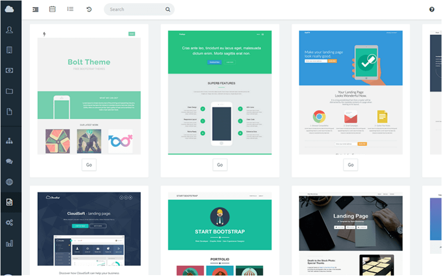
The elements of a successful landing page, include the tactical optimisation of things like:
- Above the fold content
- Calls to action
- Testimonials and reviews
- Videos/images
- Copywriting
However, in this article, we’re going to work through easy landing page tips that increase conversions. These are small changes that only require minutes (even seconds in some cases) to change.
If you’ve already created landing pages and you’re looking to add some %’s to your current conversion rates, these tips are a great place to start.
Let’s work our way through them in no particular order…
Contents
1. Call To Action Text
This easy landing page tip might sound straightforward, but it’s often overlooked.
Most landing page templates (and building software) come with their own generic call-to-action buttons. These buttons look great and are easily customised to your brand, and that can cause users to leave them as they are.
This is a mistake.

Ensure that your call to action text tells prospects what they’ll be doing after they click.
Make sure that your call to action text tells prospects exactly what they’ll be doing after they click!
Avoid text like:
- Get Started
- Sign Up
- Click Here
Opt for specific text, for example:
- Join Einstein Marketer Insider Now
- Download Your Free eBook
- Create Your Account

Tell your prospect what will happen after they click in as few words as possible.
This will increase conversion rates and ensure a smoother journey for your prospects further into your funnel.
2. Exit Intent
100% of visitors probably won’t convert on your landing pages (but if they do, please tell me what you did to achieve it).
The prospects who decide against taking your offer will almost always try to exit the page by clicking the ‘x’ to close the window or tab, or by clicking on the ‘back’ button.
This action is known as ‘exit intent’ and fortunately for us, we can target it with one last ditch effort with a pop-up.
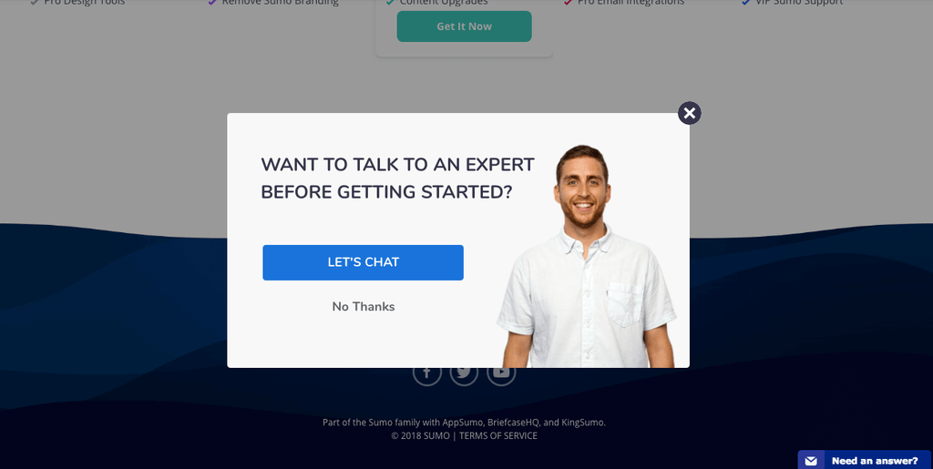
An exit intent pop-up on your landing page allows you to make downsell or upsell offers to your prospects.
For example, if your landing page is offering a lead-generating ebook, you might want to use an exit-intent pop-up to add another bonus to the offer.
This easy landing page tip can make a big difference in the long term. My most recent exit intent pop-up is converting at just over 3%!
My preferred software for this is Optinmonster, but you could also try Privy or Thrive Leads.

Important Pro Tip: Set your ‘exit intent sensitivity’ to low, so your pop-up software does not accidently trigger over your landing page!
3. Aim For One Goal
It’s exciting when a prospect visits your landing pages. It means an opportunity to sell your offer to a qualified prospect.
But, that does not mean that you should be selling multiple offers, products or services on your landing pages.
There is a time for upselling and downselling, but it is not within the copy or content of your landing pages.
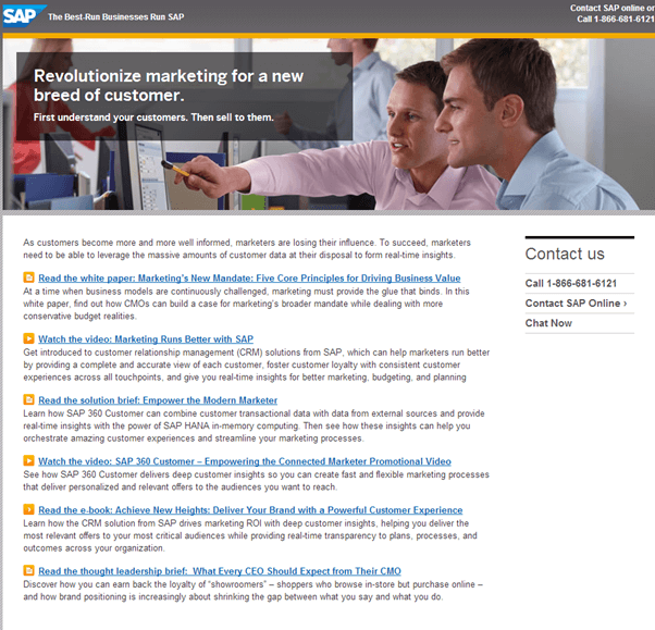
When a prospect visits your landing pages, your only aim should be to convince them to take one specific offer and everything on your page should reflect that.
Optimise for this easy landing page tip by removing alternative products and offers, unless they’re comparisons that make your landing page offer more attractive.
When your prospect has made a decision, whether that is to accept or reject your offer, you can make an appropriate follow-up with an up or downsell.

4. How It Works Section
We live in the age of information and this has made consumers incredibly savvy.
Prospective customers that are on the fence want to know more than just the benefits of your offer. They’re interested in how your product works.
Create a landing page element that explains how your product works in as few steps as possible. Try to condense this process into 3 steps (max. 5).
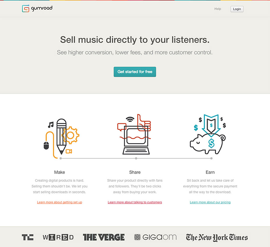
Keep things simple and understandable and speak in your target market’s language. Show them these steps from their perspective.
Reduce copy to as few words as possible and include visual explainers where necessary.
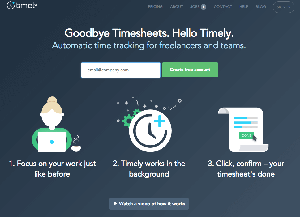
And remember, the steps should end with the prospect in the ‘after state’ that they’re craving (e.g. the ‘after state’ of a prospective customer of a weight loss program might be them losing 20lbs).
5. Colour and Offer Identity
Colours are important. They play a big psychological role in your prospect’s decision making process.
BTW: Read more in the Psychology of Colour in Marketing.
But that’s not the only reason that they’re so important to our easy landing page tips guide.
Your colours need to fit:
- Your brand
- Your offer
- Your target demographic
- Your prospect’s referral path
The first 3 points on that list are self-explanatory, and I imagine that you’d already taken them into account, but no.4 can be overlooked.
‘Your prospect’s referral path’ means the route that they took to your landing page.

This ad for the Einstein Marketer studio leads to this landing page…

If your prospect visits your website via an ad, that ad should look like a small piece of your landing page. This includes matching your colour choices.
Capturing attention is important, but offering identity is more so.
Ensure that your prospects trust your landing pages by making them feel like they’ve landed on the right page!
6. ‘Hover’
This easy landing page tip really is a simple one.
Your important landing page elements, like your call to action buttons, should change colour shade when a user hovers their mouse over them.

This makes the page interactive and increases a prospect’s urge to click!
I recommend copying and pasting the same colour code as the original button element, and then using a colour grid to slide the colour to a slightly lighter shade.
7. Form Length
You’ll need to use a form when capturing contact details on your landing page.
The length of your form can make a big difference to your conversion rates, but that isn’t always a good thing.
A short form asks prospects for fewer details. For example, the shortest forms only ask users for their email address.
These forms tend to have higher conversion rates, but they can generate a lower quality of leads and a much lower buying intent in those that you collect.
Alternatively, longer forms ask users for many more details. These might include details such as:
- First name
- Last name
- Email address
- Telephone number
- Address
- Age
- Occupation
- Business size
Long forms that include questions like this convert at lower rates, but they generate great leads to follow up with.

The more you know about a prospect, the better you can tailor your offer to them.
If you’re aiming for volume, shorten your forms. If you’re aiming for high lead conversions, ask prospects for more details on your landing pages.
8. Replace Copy With Customer Quotes
The only thing more powerful than brilliant copywriting on your landing pages, is when your existing customers write the copy for you.
Customer reviews and testimonials generate:
- Social proof
- Trust
- Demand
If you have a lot of reviews, don’t restrict their usage.
When you use sales copy that says the same thing as a previous customer’s review, trade out the copy for the review.
Include the customer’s name and one other piece of information, e.g. their location (B2C) or their job title (B2B).
9. FAQs
Many websites have their own frequently asked questions section, but they’re not always used on their landing pages.
Your landing pages were built to convert prospects on an offer. In many cases, prospects will have questions, concerns or specific needs. If these are left unanswered, your prospect will exit the page and not convert.
An FAQ section can answer a prospect’s questions, alleviate their concerns and handle objections.

Put yourself in your prospect’s shoes and write down any questions that:
- They might have about your offer
- That would stop them accepting your offer
Create a shortlist of 4-8 questions and answer them.
When you’re ready, publish them on your page!
10. Ask Questions
Landing page headlines usually consist of your best copywriting. Subtitles are made up of your second best, and so on…
…and as great as it is to keep reminding your prospects of your product’s benefits in clever sounding sentences, sometimes it pays just to ask your prospects a direct question.
Questions capture immediate attention, get prospects thinking and demand answers. Use your text to ask your prospects the right questions.

For example, a landing page for a fitness program might include the headline:
‘Get Your Dream Body In Time For Summer’
(Pretty uninspired, I know).
But a question could be much more powerful:
‘How Many Summers Has It Been Since You Had Your Dream Body?’
Ask questions on your landing pages and your prospects are much more likely to sell the offer to themselves.
11. Speed matters
Load speed is vital to the success of your landing pages.
After all the hard work and money that you’ve put into building the landing page writing the copy, creating the images and videos, tying up your CRM, creating a follow-up email sequence and driving visitors to your landing page, the last thing you want is for a slow loading website that prevents visitors even seeing it!

Speed matters.
Try following some of these landing page tips to speed up your pages:
- Reduce image file sizes (learn 5 image SEO tips)
- Use a CDN
- Upgrade your server
- Use a speed optimised landing page theme or builder
- Host videos elsewhere (e.g. YouTube, Vimeo, Wistia) and embed them via links
Easy Landing Page Tips
Our 11 easy landing page tips are:
- Call to action text
- Exit Intent
- Aim for one goal
- How it works section
- Colour and identity
- Hover
- Form length
- Replace copy with customer quotes
- FAQs
- Ask questions
- Speed matters
Follow these landing page tips to increase your conversion rates, starting today! And remember, don’t try to appeal to everybody, tailor your landing pages to your target market and nobody else!
Be ultra-targeted.
If you have any easy landing page tips that you’d like to add to this guide please share them in the comments section!
- Author Details


One Response
Landing pages are so important for any business whether be small or big.
Thanks einsteinmarketer for giving so many options to choose from for the landing page.