If you sell stuff online, and you’re NOT asking yourself, ‘how can I grow my business?’
You should probably quit now.
But, for everyone else, we’ve got a neat little answer to that question…
…OPTIMISE YOUR CART ABANDONS!
That’s right. You can earn some serious growth from people who DIDN’T BUY.
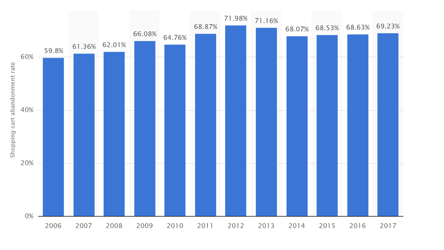
In order for us to do that, we need to analyse WHY people are leaving (before they hit that all important buy button), but first, let’s take a peek at what percentage of potential buyers are abandoning their carts:
Source: Statista
Yep, it’s horrible reading, but there’s no point burying your head in the sand. Take a look at it again, what do you see?
I see opportunity, and so should you.
Last year, 69.23% of visitors abandoned their cart before purchasing. That’s 7 of 10 shoppers!
In other words, the only money you’re making is from 3 of the 10 people who initially wanted to buy.
But, we can fix it.
Baymard Institute reports that an average site can gain an extra 35.61% from these disappearing buyers and the key tactic behind that figure will be a cart abandonment email sequence…
…but we’re not going to cover that today. Don’t sweat it, I’ve got an in-depth guide to that coming soon called, THE MEAT AND POTATOES OF CART ABANDONMENT EMAILS, so keep an eye out…
…but, I feel like I MUST write this blog first, for two reasons:
Reason #1: It’s harder to convert a prospect into a sale after they’ve left your site.
Reason #2: Loads of people have asked us how to write a Cart Abandonment Email Sequence, and after investigation 99% of them have poor buying processes, that encourage cart abandonment.
Comprende?
Cool. Let’s handle our first truly terrifying statistic.
Mobile Buyer Abandonment
And I bet you thought MBA’s were a good thing, that the academic achievement would sound cool at the end of your name…
…not this type of MBA.
But, if you’re selling stuff, you’ve definitely got MBA.
Barilliance conducted a study, measuring Cart Abandonment levels, and (despite their average results coming back slightly higher than Statista’s) they discovered this:
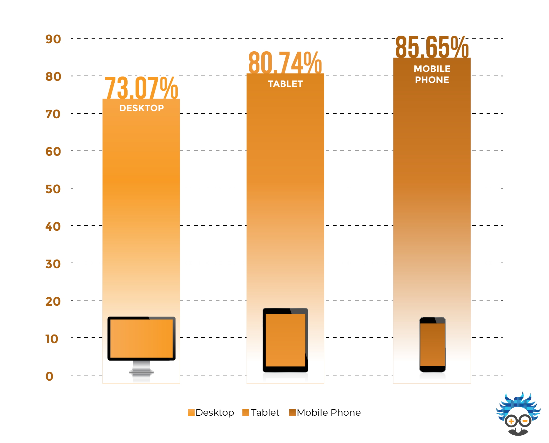
Your eyes are not deceiving you, 85% of mobile shoppers DO NOT BUY after filling their shopping cart.
So, what can you do to improve this?
For starters, all of the tactics I’m going to give you in the rest of this article…
…but, please, please, please, make sure your website and buying pages are optimised for mobile.
Yes, it’s all well and good checking that your pages look pretty but optimising for mobile means much more than this.
Put yourself in your customers shoes, why are they on their mobile instead of a computer or laptop? Where are they? What are they doing?
These answers will be specific to your target market, but here’s a few examples…they’re out of the house, they’re waiting somewhere, they’re relaxing, they’re commuting…
…these are not barriers that prevent people from buying.
You should reverse the process, and optimise your buying page with these things in mind:
How simple is it? Do they have to get their wallet out? Are they going to have to enter every card number while walking? How many fields do they have to fill in? How many pages do they have to go through? Do they have to become members?
If you’ve purchased anything on Amazon in the last 6 months, you’ll know that they use one-click buy buttons, a swipe-to pay system and Apple Pay on mobile.
All of these systems reduce the amount of work a potential buyer needs to perform.
Less work = lower MBA.
When optimising your buying site for mobile buyers, think minimally, go for ease and speed of purchase and consider why your prospect is using a mobile and not a desktop.
If you can get all that right, you’re ready for our cart optimising tactics.
Cart Abandonment: Why?
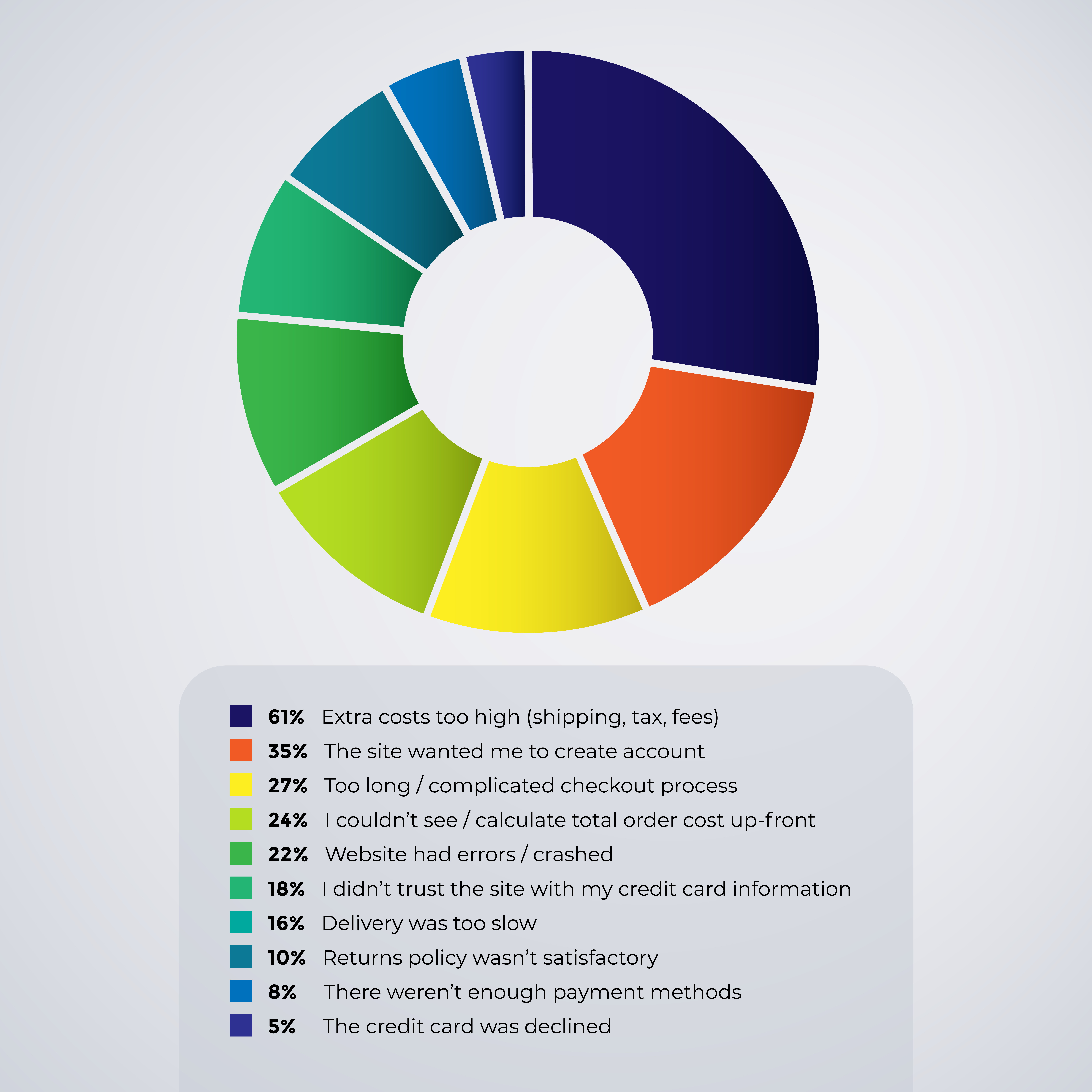
Creating tactics to combat the scary 69.23% of people that abandon their carts, is pretty simple. Analyse the reasons WHY they leave and handle each problem head-on.
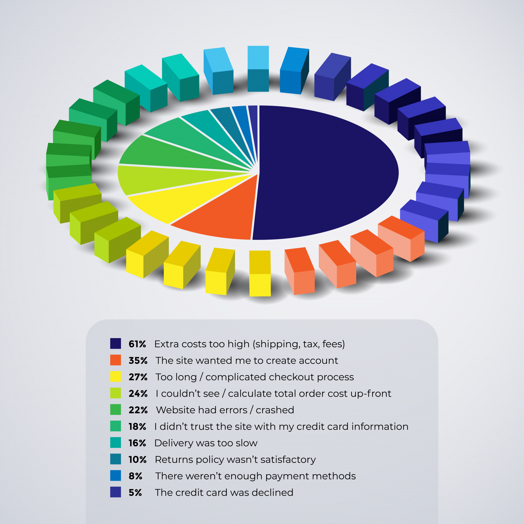
We’ll do that using a handy little graph I’ve put together for you:
Stats Source: Baymard Institute
Extra Costs Too High- 61%
Kicking us off, we’ve got a whopping 61% of cart abandons caused by high additional costs, these include shipping, handling fees and (sometimes) tax.
Of the 7 out of 10 people that disappear before buying, 4.27 of them cite this as a reason. That’s almost half of your potential sales!
A buyer’s mentality is set firm on price. If they see a product they’re interested in, and they mentally prepare themselves to spend £24.99 on a purchase, and then they come to buy it and it’s actually £29.98 (inc. shipping) they start to feel…
…like it’s a bad decision, or it’s overpriced, or it’s not the bargain they thought it was.
Some of you might be twitching uneasily about reducing, or even offering free shipping to customers…
…but, it’s going to massively increase your cart conversions.
If you’re sweating about your profit margins, make sure you’ve already found the cheapest possible delivery method, and check if your shipping fees are higher than it actually costs to deliver…
…if you’re trying to be clever by increasing your margins with shipping fees, you’re actually missing out on (potentially repeat) paying customers.
A reduction in shipping fees by just £1 will massively reduce your abandonment rate. Especially when you consider that 62% of people ALWAYS choose the cheapest shipping option.
If your cheapest shipping option isn’t cheap, you’re missing a trick.
I’d suggest running a FREE SHIPPING OPTION for orders over (insert your average sale value)…
…FREE SHIPPING for members/referrals/sharers…
…or take a small cut in your margins, for the benefit of greater sales numbers.
Here are a few examples of companies offering FREE SHIPPING OVER… :


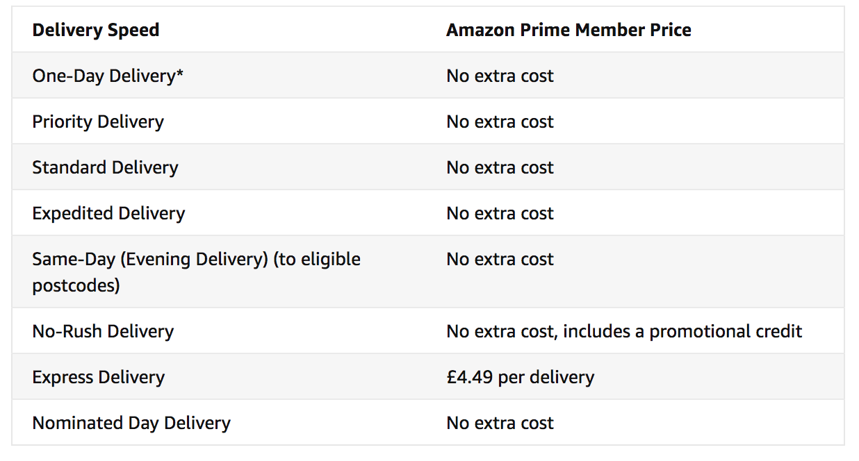
And, how can we possibly talk about reducing shipping costs, without mentioning Amazon Prime?
The world’s biggest retailer has proven just how much people hate to pay that little bit extra for shipping, by creating a PAID membership, that ensures you’ll never have to pay delivery fees again.
The Site Wanted Me to Create an Account- 35%
The next biggest cart abandonment reason is a real kick in the nuts…
…there we are, opening our arms to potential new customers, ready to welcome them to our digital family, and instead of encouraging them to purchase…
…it actually scares them off!

There are a bunch of different psychological reasons for this, prospects can feel like:
-It’s extra work
-They’re going to be bombarded with marketing communications
-They don’t want to share their personal information
-They’re only there for a one-off purchase, so why should they create an account?
Whatever the reason, telling your potential customer that they MUST create an account looks like a BARRIER to purchase…
…so, knock it down.
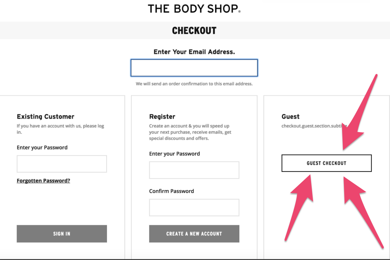
You can do that by offering a ‘GUEST’ checkout option:
Or by not even asking users to create an account:
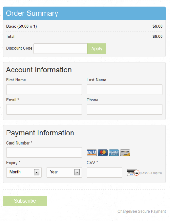
If you do the latter, you can still ask them for their details (you’ll need their email for receipt, name and address for delivery, and telephone for communications) effectively creating them an account anyway…
…or you can email them with their receipt, offering them a reward for becoming part of the family.
Too Long/ Complicated Checkout Process- 27%
This is the single MOST IRRITATING ENTRY on our chart.
A potential customer wants to buy something from you, so instead of making it easy for them, you ask them to fill out tons of unnecessary fields, stretched over 3 pages, without clear directions or buying/confirmation buttons…
…or your font is too small, or unreadable.
I look at this problem like this, have you ever walked into a shop desperate to buy something, only to see an enormous queue, and walked straight out?
A complicated, annoying and slow purchasing process is like that ridiculous queue. It’s arduous, boring and kills the excitement of buying stone-dead.
Buying should be as quick and straight-forward as possible.
When a customer has loaded up their shopping cart, confirming they want to pay, they should be taken to ONE PAGE! Make this as simple and minimalistic as possible.
Don’t bombard them with questions or blow them away with tons of required information. If you can, have dropdown forms for each section…
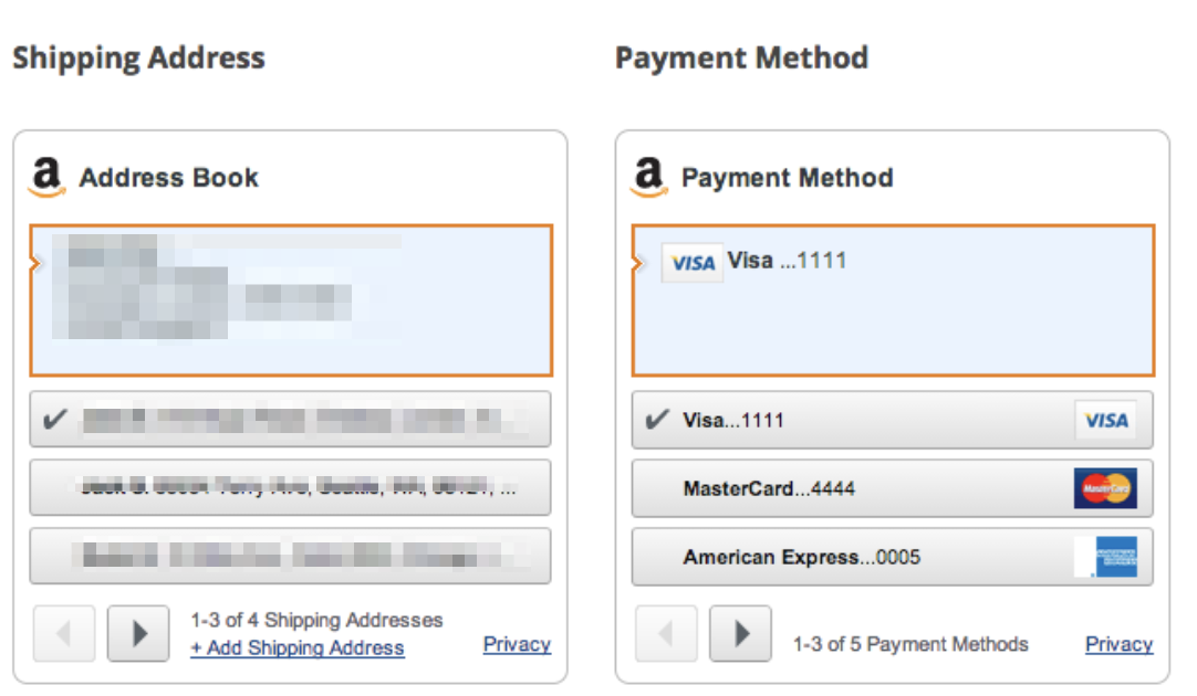
Designs like this look simple and are incredibly straightforward to use, effectively eliminating the 27% who abandon due to complicated checkout processes.
I Couldn’t See/ Calculate Total Order Cost Up-Front- 24%
Wanting to know the price is the first psychological demand in (the majority of) buyer’s minds.
You do it all day long, every time you go shopping, surf the internet, go out for dinner…
…when you see something that interests you, the first thing you want to know is PRICE.
So, when a customer can’t see the total price of their cart, they get frustrated and disappear.
An effective way of combating this is to always have the cart visible:

And having the cart’s items and total price available:
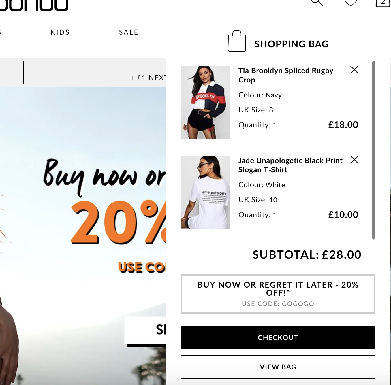
As soon as your customer confirms that they’d like to make a purchase, KEEP THE TOTAL PRICE IN VIEW.
The easiest way to do this by having a STICKY WIDGET at the righthand side of the page:
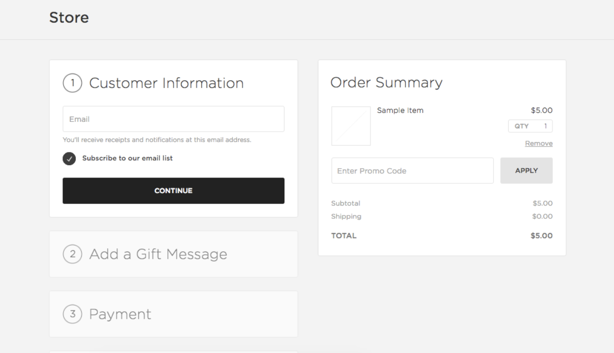
These (very simple) techniques will handle this very frustrating mistake that TONS of online retailers make time and time again.
Website Had Errors/ Crashed- 22%
This is one problem that might not actually be your fault.
If your customer has a poor internet connection, it’s not something that we can correct…
…but, we can definitely make load speeds faster by removing bulky, slow-to-load page elements like large video files, ultra-hi-res images and unnecessary widgets.
These elements might make your buying page look beautiful, but there’s no need for them here. The customer has already been through the evaluation stage, we just want them to purchase.
Another way to improve load speed is to attach a Cache plugin to your website. We use W3 Total Cache. This super-fast tool reduces our bounce-rate and keeps our audience happy with ultra-quick page navigations, meaning fewer errors and website crashes.
I Didn’t Trust the Site with My Credit Card Information- 18%
Ecommerce has been around for so long, that we’ve all heard a horror story about digital crime…
…and that has made people increasingly wary, especially if it’s their first visit to your website.
Fortunately, there are plenty of SSL companies, that secure and protect sensitive user data. If you’re selling online, you NEED to get one.
18% of cart abandons happen for this reason, but we should assume that, that number would be a lot higher, if there were more sites without SSL certificates.
And, once you’ve paid for it, YOU MUST display the badge on your site, especially on the BUYING PAGE.
Even if you’ve put the badge on every page of your site, except your buying page, visitors may still miss them, and cite ‘a lack of trust’ for not completing their order at the crucial moment.
There are tons of different verified badges to choose from, here are a few of the most popular:
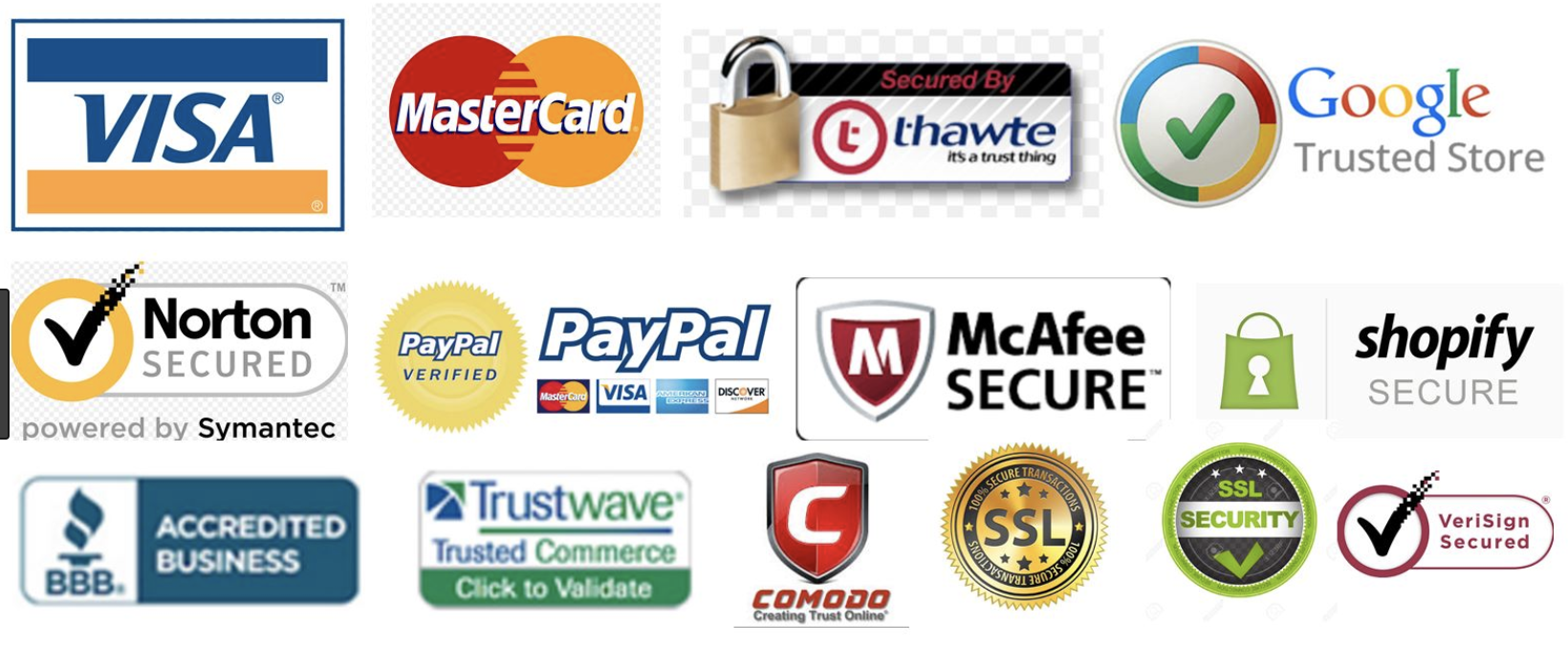
The more recognisable the badge, the greater the trust, and the less chance of cart abandonment.
But wait, there’s more…
…your site should be set-up as HTTPS. Websites that still run as HTTP will be displayed like this on the Google Chrome Browser (from July 2018):
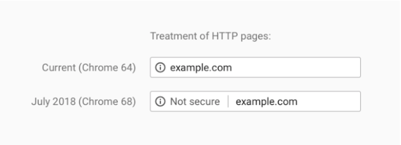
Would you buy from a website that says ‘not secure’ by your trusted browser?
We don’t think so.
There is another massive benefit when using HTTPS too, Google prefers to rank SECURE sites higher than UNSECURE sites…
…this means more qualified visitors entering your website, and more potential buyers.
Delivery Was Too Slow- 16%
This is an often-voiced problem with Dropshipping companies, who deliver directly from suppliers, usually based in China.
If you’re not dropshipping, and your standard delivery is no longer than 5 working days, you’re fine…
…as long as you ALWAYS offer an EXPRESS SHIPPING option.
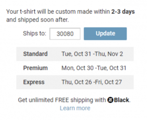
Many of us leave things to the last minute, and internet shopping is no different. These people know that there is a price to pay for Express Delivery, and they’re willing to pay it! So please, make sure you offer them the option.
As for the all those dropshippers out there, you can greatly reduce your delivery times, by scaling up (when the time is right), buying in bulk and paying for a Fulfilment Warehouse. These businesses will pick, pack and post every delivery for a small fee, (usually on the same day of purchase), bringing your delivery time down to super-fast levels.
Returns Policy Wasn’t Satisfactory- 10%
This is really simple stuff…
…when you’re selling online, you need to have a RETURNS POLICY, and a decent one at that.
Visitors don’t have the chance to inspect the product/service before they buy, so it’s natural for them to have some doubts.
A thorough RETURNS POLICY will allay these worries.
Create a page for this information, and link to it on your buying page. This page is also a great place to put a ‘carousel’ widget of buyers’ reviews, as it adds social proof, and offers a reassuring bump to your prospective customer.
And let’s face it, if you’re selling something that you know works, and have complete faith in, why wouldn’t you offer a thorough returns policy?
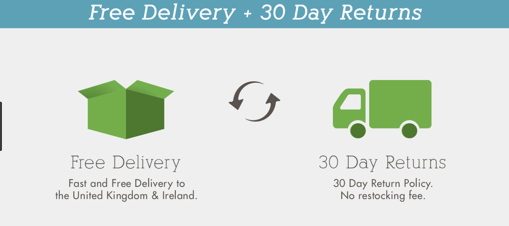
Two amazing trust-factor boosters are WARRANTY’S and FREE 30-DAY RETURNS. Prove that your product rocks with one of these policies.
They Weren’t Enough Payment Methods- 8%
Last (on our list), but certainly not least, we’ve got payment variety (because I’m not going to analyse CARD DECLINES– 5% on our chart).
According to research from Milo, 56% of online shoppers expect a variety of payment methods.

This doesn’t mean adopting every single different type of digital payment. The important thing to know is how your target market would like to pay. You should also take into account the types of payment your competitors accept, and the price levels of your product.
I’d suggest visiting a few different industry-leader’s websites, going to their buying page, cross-referencing the results and opting for the most popular. They will be targeting the same market as you, so why not let them do the hard-work?
The Agony of Cart Abandonment
7 out of 10 people abandoning their shopping carts is just too high, and together we can do something about it.
These tactics will effectively eradicate some of the reasons people leave their shopping and increase conversions.
Your products and services should make consumers lives better, and it’s up to you to provide them with the easiest buying process possible.
Analyse your buying process, optimise your pages to prevent abandonment, and we’ll back soon with methods to draw back the few that slip away with our, Meat and Potatoes Guide to Cart Abandonment Emails article.
Do you suffer from high levels of cart abandonment? What do you do to combat it? Leave a comment or send us a message and we’ll reply as soon as our account manager has stopped watching ‘Love Island’.
- Author Details


One Response
hi!,I love your writing so so much! share we keep up
a correspondence more approximately your article on AOL?
I need a specialist on this house to resolve my problem.
May be that’s you! Having a look forward to peer you.