Ever heard the expression first impressions count?
Above the fold is the digital world’s equivalent of that catchphrase.
If you’re a keen student of all things digital marketing, take an interest in psychological marketing techniques or know a thing or two about UX and its impact on conversion rates, stick around.
In this guide, I’ll explain what above the fold really means to website owners and marketers, why you should be focussing on it and how you can use it to boost lead and sale conversion rates.
Let’s start with an above-the-fold definition…
What is above the fold?
In the digital world, above the fold relates to anything that a visitor can see when they initially land on a webpage without scrolling.
As soon as a visitor scrolls down, they reveal the ‘below the fold’ content.
The line of ‘the fold’ effectively lies where the immediately viewable part of a page ends, this is usually at about the 600-pixel point for desktop and laptop visitors provided they have no toolbars on their browser and have the screen at full size (more on mobile later).
Contents
What are the Origins of Above the Fold?

The term ‘above the fold’ actually came into being a long time before the invention of the internet.
It was first used to describe the upper half of a newspaper page that’s viewable when a newspaper is folded – which usually occurs on newsagent stands.
The above-the-fold content became a fundamental element of success for newspapers – with sensationalised headlines and eye-catching (and sometimes shocking) images published there to capture the attention of prospective readers.
The better a newspaper’s ‘above the fold’ content, the more readers they’d be able to attract.

Why is Above the Fold Important?
First impressions count, especially in a digital world where the attention spans of our visitors are steadily decreasing.
The right use of above-the-fold content can have a dramatic effect on the success of your digital marketing, particularly on the conversion rates of leads and sales on your landing pages.
Use the right content here and you’ll convert prospects thick and fast, but use the wrong content above the fold and you’ll lose visitors before they’ve even looked at your offer.

Think back to the last landing page that you visited:
- What was the above-the-fold content?
- Did the above-the-fold content influence your decision?
- Did you scroll down below the fold to discover more?
- Did you exit the landing page without scrolling any further than the above-the-fold content?
These are all questions that marketers and online business owners should ask themselves when visiting any landing page online.
BTW: I’ll explain a few above-the-fold landing page conversion tips very soon!
Above-the-fold tactics are also crucial to the success of your content and website in general – particularly when it comes to user experience.
This is something that content marketers should pay special attention to, especially given the weight of importance that search engines are placing on user experience.

Google has been the forerunner in this, with their recent Page Experience update revealing the metrics (and scores) that website owners should be aiming for in order to rank higher in the coming years.
Above the Fold Tactics – Landing Pages
Above-the-fold content has a big impact on the success or failure of your landing page conversion rates.
It’s the first thing a visitor sees when they land on the page, and more often than not, it’s the last thing they see too.
Don’t neglect your above-the-page tactics!
The content you use above the fold on your landing pages is largely dependent on two factors:
- Your relationship with the prospect
Are they a lead? Have they been retargeted? Are they already aware of your brand? Have they already purchased something from your business?
- The type of offer that you’re making
Are you offering a lead magnet? A sales call? A product purchase? An upsell? Or a down-sell?
Consider where your prospect is and where this aligns with your offer before deciding what you should use above the fold.
That being said, there are a number of tactical elements that every landing page should consider using above the fold, they include:
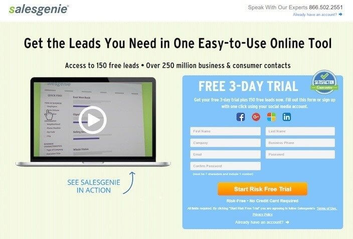
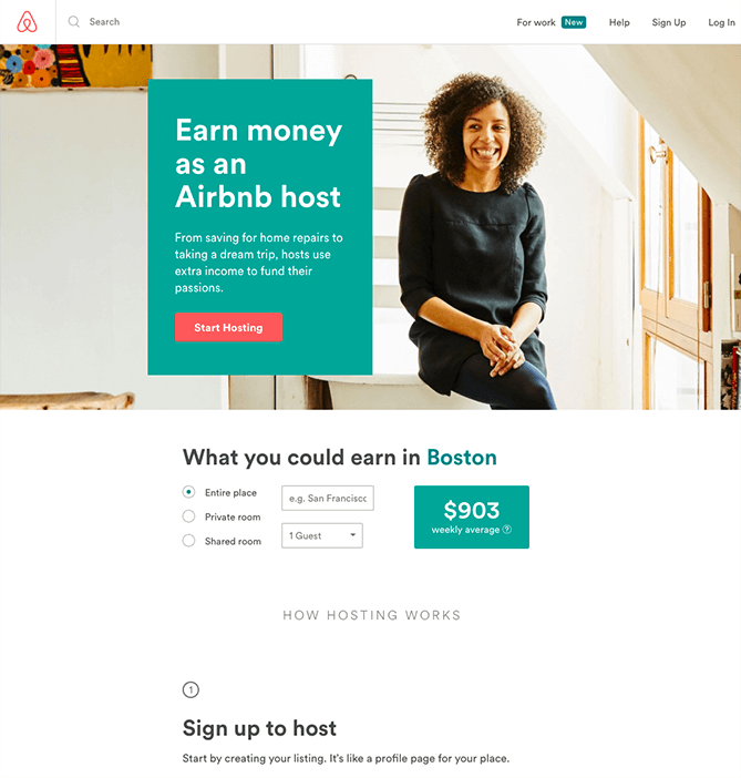
A Headline

Much like those newspapers fighting for attention, a landing page should include an influential headline.
In some cases the name of the product, lead magnet or offer is enough, but for others, the use of sales copy as a headline helps prospects move towards the CTA.
Video/Media

Whatever it is that you’re offering on your landing pages, you need to visually include it above the fold – even if it’s a service, try to find a visual representation.
A prospect always wants to see what they’re buying before making the purchase – do this ASAP by including it above the fold.
If your product is a service or software, use a demo video to show your prospects the ins and outs of your offering.
The decision between video and imagery depends on your product and relationship (although I’d almost always advice you to lean towards video).
CTA

If you’ve got an offer that you believe in and you’ve reached the right people with it, its inevitable that there will be people landing on these pages with a ‘ready to buy’ mentality.
You MUST provide these people with an immediately viewable CTA (call to action) in your above the fold design (a buying button).
Yes, you should place CTA’s below the fold as well, but placing them above the fold is an absolute must.
If you’re not currently using an above the fold CTA, you’re risking losing potential leads and conversions.
Copy

A headline should be backed up by a compelling piece of copy (or a company strap line) that urges visitors towards your CTA.
Focus on the basic principles of sales copy – benefits, before and after states and speaking directly to a target market that can associate with you.
If you’re using sales copy as your headline, you could use your next favourite piece of copy to back it up as a sub-heading.
Congruency

The ad, image or email that directs visitors to your landing pages must be harmonious with your landing page design.
Let your visitors know that they’ve reached the right page by using similar colours, images and language in your above the fold content.
Above the Fold Tactics – Content
After somebody clicks on your content, your next task is to get them to consume it.
This means using a few simple tactics above the fold to get visitors to scroll down.
By encouraging people to actually watch, listen or read your content, you stand a much better chance of building a relationship with them and moving them through your content marketing funnel.
Here are a few simple principles that any content marketer can implement immediately…
Title

Using the title in your above the fold content sounds very straight-forward, but it’s still something that’s occasionally overlooked.
Ensure that your title is included somewhere – this will inform visitors that they’ve landed on the correct page.
Image

A page of pure text doesn’t provide an engaging visual experience.
Use an image that best represents the topic or title of your content in your above the fold content.
Brand logos, social proof or visualised benefits are a great way to get visitors scrolling down into your content.
Date

When I’m browsing through content, one of the first things I look for is the date – and that’s why I always leave it at the top of the page.
Evergreen content is timeless and relies less on the recency of its publish date, but when it comes to more technical, trend following or digitally relevant content, being up-to-date is very important.
Update old content that performs well to ensure that it keeps on providing you with the returns you deserve.
Author

I know a lot of writers, creators and brilliant marketers within my space – and when they publish content, I like to be reminded of it.
Revealing the author in your above the fold content provides social proof, can help build an individual brand (or following) and get regular visitors excited to read!
Reasons to read (or watch/listen)
For almost every visitor, the title, image, date and author are enough to get them past the above the fold content.
However, some visitors will have clicked on your content link just to find out more – these people need another reason to read.
I’d recommend using a line or two of copy about the content on the rest of the page – aim for the biggest take-away for a visitor if you’re stuck.
Social Proof

Social proof isn’t a 100% necessity but it certainly makes a valuable addition above the fold.
If you have a lot of social shares, and comments or are collaborating with a large, well-known entity in your industry – show it above the fold.
This will get people moving down through the rest of your content.
Above the Fold On Mobile
Mobile is the most popular device for browsing the internet – so it certainly needs to feature in your above-the-fold content tactics.

With a difference in size and a much more vertically shaped viewing area, your ‘above the fold’ content will still appear to mobile viewers, in addition to some of your normal ‘below the fold content’.
Ensure that your site design is mobile optimised and that your layouts are accessible (and navigable) for visitors from any device, in addition to considering the structure and layout of your immediate ‘below the fold’ content.
Viewing ports (aka mobile above the fold) vary across devices, but your mobile above the fold content tends to be at about the 1000-pixel point.
Above the Fold
First impressions leave a lasting effect – especially when you’re trying to convert new leads or customers.
Really think about the structure, layout and placement of your landing page content, and use well-thought-out above-the-fold tactics to encourage visitors to consume your content.
Just remember to analyse your own experiences and reactions to the above-the-fold experiences of other sites – and learn from them!
- Author Details


